Visualizing my essay
I took time to visualize an essay that I wrote in April, to compare this form of writing with that of blogging. To give it a fair analysis, I took five blog posts from course related work where I simulated academic or scholarly author’s voice in order to approximate the writing I do in an essay format.
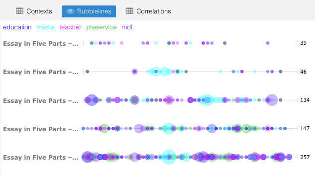
Here are visualizations from the essay – Infusing media & digital literacies into preservice teacher education: A Literature Review capture in five parts (posted from April 22 – 27th, 2019).
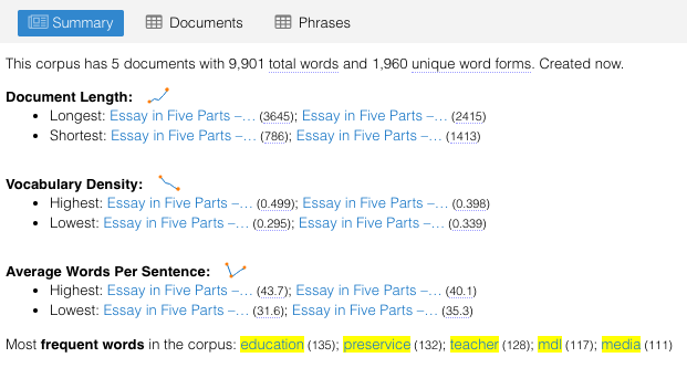
This visualization is available at Voyant Tools – I’ll call it my Essay in Five Parts. Some observations from these visualizations:
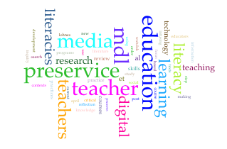
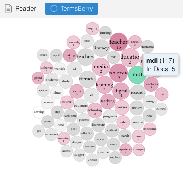
- key words appeared as I expected them – specifically ‘MDL’ since that encompasses media + digital + literacy; keywords were education, preservice, teacher, media, MDL
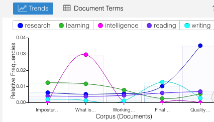
- the flow of usage across sections of the document are somewhat consistent with some spikes in section three and five, both include topics focusing on applications of MDL with preservice teachers
- the bubble lines indicates a sequential build up within each section of the essay with the final section dominated by these key terms
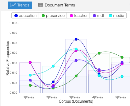
- the total number of words is 9,900 with 1960 unique word forms
- the longest sentence was 43.7 words and the shortest sentence had 31.6 words – this surprised me because I hadn’t realized there was significant wordiness to the sentences written – not sure this is the best way to communicate this important information.
- the density of words ranged from .499 to .295 with the introductory sections the most dense and the concluding section the least dense.
NOW the comparison to five preselected blog posts:
- Imposter Syndrome and Motivation – November 29, 2018.
- What is Intelligence? – November 19, 2018.
- Working on Working Memory – September 20, 2018.
- Final Research Journal for DS1 – July 24, 2018.
- Quality in Research for DS1 – July 18, 2018.
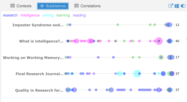
Once again, I turned to Voyant Tools to bring some light to my writing. The unique link for this one is found at Blogging not Essays.

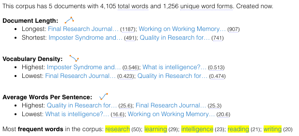
For this analysis, these are some observations:
- key words were a surprise, but appropriately connected to the topic of each blog post e.g. the work intelligence was highest on the blog post What is Intelligence?
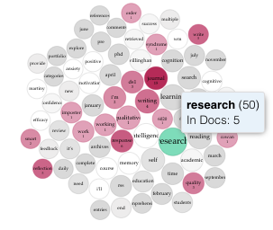
- the termsberry indicates that the term research was used 5o times across all five blogs
- the total words was just over 4000 with over 1250 unique word forms used
- the highest density of vocabulary was in the Imposter Syndrome blog post and surprisingly, the lowest density was in the final research journal I submitted for DS1
- the average words per sentence ranged from 25.6 (Quality in Research) to 16.6 (What is Intelligence?). Since I suspect this impacts readability, I’ll need to look at this closer when working on the dissertation.
- the interesting collection of distinctive words from each blog shows some citation connections e.g. Willingham, Cowan, Meyrick
I think this is enough for now, but I’ll need to remember this visualization tool as I produce more academic writing. It is helpful to bring certain trends, biases, and foci to light.